I'm happy to announce the release of Angular Material 1.1, now available for use with Angular 1.x applications.
We've also added some new faces to the team. Welcome to Erin, Paul, and Kristiyan as new core contributors. As lead for one of the internal Google projects using Angular, Erin and her team contributed to Angular Material 1.x with architecture designs and implementations for the new <md-nav-bar> and $mdPanel components. Paul and Kristiyan are developers from the open source community who joined the core team just before 1.0, at the end of 2015.
Why should you update from Angular Material 1.0 to 1.1?
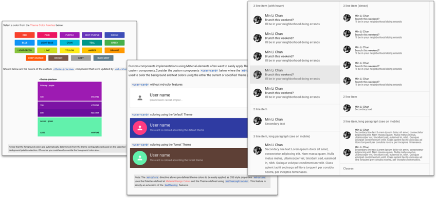
With more than 700 commits, the updates in version 1.1 directly improve the responsiveness and stability of Angular Material components. In particular, this release improves the behavior of Tooltip, Progress Indicators, Menu, Select, Chips, and AutoComplete components.You'll also find new components nav-bar, colors, theme picker, dense layouts for lists, vertical sliders, select-header, and more.
Finally, we've added community-requested features for global-level control over appearance, including disabling themes, layouts, and/or ripples. For full details, see the changelog.
We anticipate that most apps will find it easy to update to 1.1. As part of upgrading, you'll want to check the CSS, colors, and spacings on 1.1, especially if you have applied customizations.
What about Angular 2.x?
Angular Material 2 continues in alpha preview. Since we announced our first alpha release, we've grown from six to eighteen components, and have been using Angular Material 2 as one of the validation tests for each Angular 2 release candidate.You can see the published components on npm and follow our development progress on GitHub.
0 comments:
Post a Comment