Showing posts with label material. Show all posts

Friday, 27 January 2017

Branding Guidelines for Angular and AngularJS

Angular
In September of last year we made several big announcements. We released version 2.0.0 of Angular and that we were adopting Semantic Versioning, meaning that developers will see version number increases in a planned and careful manner. As a result of these announcements, you’ve seen us using the term Angular to refer to all versions of the framework after 2.0.0.


We’ve had a great response from Developers about this. Bloggers and authors and discussions boards can in most contexts drop the version number from discussions of Angular, because the tutorials, tips, tricks, and content that works in version 2 will work in version 4, and likely beyond. This allows those discussing Angular to talk about the framework without becoming prematurely dated each time there’s a version bump.


Here’s an example tutorial you could write:


Correct
Angular Router Guide - Learn about how to use the Router in Angular as the basis for page animations, analytics tracking, and how to fetch parameters and data reactively from the router.
Incorrect
Angular 2 Router Guide - Learn about how to use the Angular 2 Router as the basis for page animations, analytics tracking, and how to fetch parameters and data reactively from the router.

Reasoning
By not using “Angular 2” in the title, the content still feels applicable and useful after version 4, 5, 6, 7, etc have been released, as the syntax is unlikely to change.


AngularJS
Our announcements around “It’s just Angular" were the first step in bringing consistency into the naming of the platform and the ecosystem. Our recommendation last month was to use Angular 1 for all 1.x versions of the framework and Angular for all the subsequent versions (unless a version was required for clarification in a given context). We heard from the community that because AngularJS has been used for for so long, it would be too hard and confusing to "rewrite history" across the web and the physical world.


We agree with this and we have accepted the suggestions many of you have brought up to return to our roots with the name AngularJS for any 1.x release, and Angular for any 2+ release. Our goal is to bring as much consistency as possible especially going forward, while reducing the maintenance burden caused by past branding inconsistencies.


These new guidelines match what already exists in a number of ways. If you are looking for a book on version 1.x, you’ll probably find it with the name AngularJS. And as more content is written consistently using these guidelines, it should become easier to search for what you are looking for.


What about Angular Material?
Angular Material is a project led by Google to build a great reusable component library for Angular Developers. The Material project takes Google’s design principles, and boils them down into components you can add your projects. We are continuing to invest in Material as a great choice for developers working with either Angular or AngularJS. To match the name guidelines, we’re clarifying the naming of the projects to “Angular Material” and “AngularJS Material”.


Brand Guidelines
For the full guidelines, check out our Press Kit.

We've been propagating these standards across all of our projects over the last week or so, but there's more work to be done. You can help by using these names to build consistency across the ecosystem! Here are some handy regular expressions if you'd like to help us fix the branding in your projects!
s/angular (1\.\d)/AngularJS $1/ig
s/angular 1\.x/AngularJS/ig
s/angular 1/AngularJS/ig
s/angular1/AngularJS/ig
s/angular 2\.0/Angular/ig
s/angular 2/Angular/ig
s/angular 2\.x/Angular/ig
s/angular2/Angular/ig

Share:

Thursday, 22 December 2016

Angular Material Beta Release, New Flex-Layout library

We're sneaking in a little holiday gift at the end of the year: two new beta releases for developers to try out with the latest version of Angular.

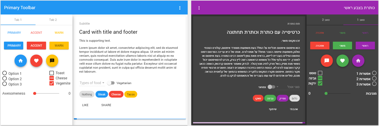
material components with a custom theme and RTL text

In March, we gave you a first preview of the new Angular Material components. Today's beta release of @angular/material includes 22 UI components written for the latest Angular: button, button‑toggle, card‑list, chips, checkbox, dialog, grid‑list, icon, input, menu, progress‑bar, progress‑spinnerradio‑buttonselectsidenavslide‑toggleslidersnackbartextareatoolbar, and tooltip. It also provides support for accessibility, custom themes, and RTL text.  For documentation and examples, see material.angular.io.

Also out in beta today, the new @angular/flex-layout package is a general-purpose flex-based layout library for use in any Angular application later than version 2.4. It provides a responsive engine and API to easily define how UI layouts should update as viewport sizes change with orientation across different display devices. The HTML API makes it trivial to quickly arrange (and auto-resize) web page component layouts. In Angular 1.x, layout tools were included as part of Angular Material. With flex-layout, we have made layout a standalone library, decoupled from the UI components. Learn more about the flex-layout beta here.

Whether you're building a new app, or upgrading from a legacy Angular 1.x app that needs Layout and Angular Material APIs, these components will help you to quickly build a beautiful and performant UI consistent with Google's Material Design spec.

What does beta mean?

We've built all of the core UI components that most applications will need. Start using these libraries, and give us feedback on GitHub.

We don’t plan to make any large API changes before exiting beta, however we’ll make changes based on feedback we receive during the beta process.

What's still in the works?

For Angular Material, developers can expect other advanced components (e.g. data-table, date-picker), and typography support. Both libraries will see ongoing bug fixes and feature improvements.
For users on Angular Material 1.x, a new release is expected in early 2017 with bug fixes and security improvements.
Share:

Thursday, 18 August 2016

Angular Material - 1.1 and 2.x

We promised in March that you'd continue to see updates on the Angular Material 1.x branch, in addition to ongoing bugfix releases.

I'm happy to announce the release of Angular Material 1.1, now available for use with Angular 1.x applications.

We've also added some new faces to the team. Welcome to Erin, Paul, and Kristiyan as new core contributors.  As lead for one of the internal Google projects using Angular, Erin and her team contributed to Angular Material 1.x with architecture designs and implementations for the new <md-nav-bar> and $mdPanel components. Paul and Kristiyan are developers from the open source community who joined the core team just before 1.0, at the end of 2015.

Why should you update from Angular Material 1.0 to 1.1?

With more than 700 commits, the updates in version 1.1 directly improve the responsiveness and stability of Angular Material components. In particular, this release improves the behavior of Tooltip, Progress Indicators, Menu, Select, Chips, and AutoComplete components.

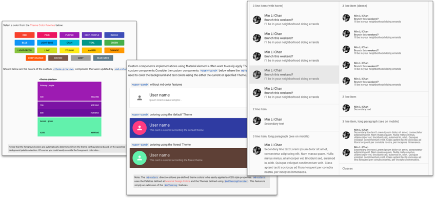
You'll also find new components nav-bar, colors, theme picker, dense layouts for lists, vertical sliders, select-header, and more.
newComponents.png


Finally, we've added community-requested features for global-level control over appearance, including disabling themes, layouts, and/or ripples. For full details, see the changelog.

We anticipate that most apps will find it easy to update to 1.1. As part of upgrading, you'll want to check the CSS, colors, and spacings on 1.1, especially if you have applied customizations.

What about Angular 2.x?

Angular Material 2 continues in alpha preview. Since we announced our first alpha release, we've grown from six to eighteen components, and have been using Angular Material 2 as one of the validation tests for each Angular 2 release candidate.

You can see the published components on npm and follow our development progress on GitHub.
Share:

Wednesday, 16 March 2016

Angular Material 2: Alpha preview!


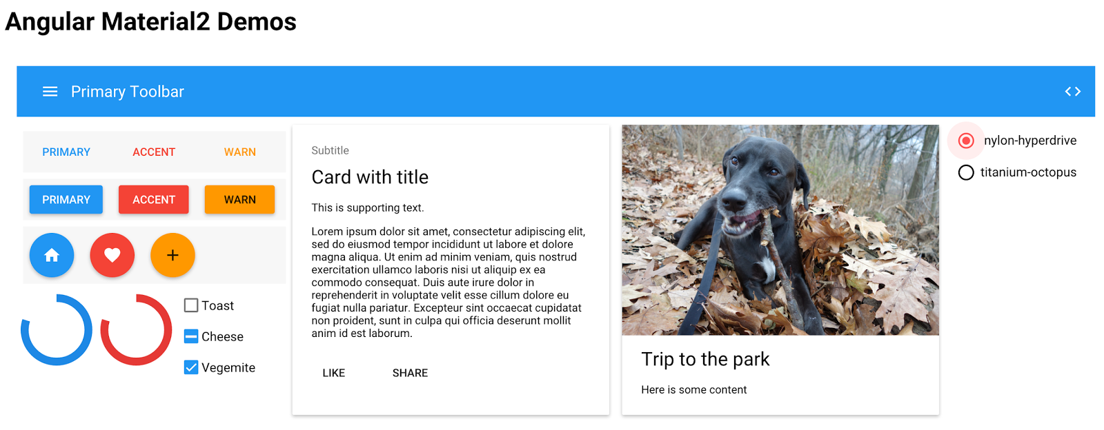
On Tuesday, we released angular2-material alpha.0 - titanium-octopus, kicking off the public availability of the initial set of Angular Material 2 components.

What is Angular Material?

The goal of the Angular Material project is to build a set of reusable Angular components that implement Google's Material Design specification. We've already built a comprehensive set of these components with Angular 1; check out https://material.angularjs.org for demos and API docs. You can see these Angular Material 1 components in action on several Google products, such as Google Trends, Google Shopping Express, and your Google Search history.

Angular Material 2 vs Angular Material 1: What's different?

The new Angular Material 2 components are built completely new on top of Angular 2 so that they can take advantage of the improvements to both Angular and the web platform. We're also taking the lessons we learned building the current Angular Material to create something better than ever.

Can I use Angular Material 1 components in Angular 2 apps?

Sadly, no. To get the full benefits of Angular 2, you'll eventually need to upgrade to Angular Material 2.

We're working on cookbook examples to help you plan the upgrade from Angular Material 1 to Angular Material 2. These will be available closer to final release.

What does this alpha mean for Angular Material 1 Apps?

This new version for Angular 2 doesn't mean that Angular Material 1 is going away any time soon.

We know that many Angular 1 applications depend on Angular Material 1 for their UI, and that adoption of Angular 2 will take time. We are committed to both branches.

While bringing Angular Material 2 to feature parity, we are also actively working on maintaining and improving Angular Material 1, through regular minor and bugfix releases. We anticipate that Angular Material 1 will be supported for a long while.

What does the alpha process mean?

This alpha release is the first small step in an ongoing, rapid-iteration process. (So rapid, in fact, that we're already at alpha.1) Over the coming months, the team is going to be constantly adding new features, fixing issues, and incorporating community feedback. APIs will break, behaviors will change, and FABs will be flying everywhere! This process will let us hone-in on the best possible set of components for Angular 2 applications.

Check out angular/material2 on GitHub for more information on how to try out the new Angular 2 components, and stay tuned here and on Twitter for future announcements!
Share: